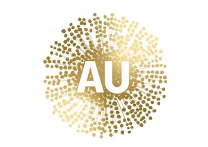
Am I the only one who wonders what the purpose could possibly be of the new Australian Nation Brand developed at the cost of $10 million for the federal government?.
The new logo replaces an earlier brand which also cost $10 million to develop and launched in 2020 to much derision – it was not instantly recognisable as wattle or ‘Australia’, and it looked like the just arrived Covid virus.

According to Trade Minister Dan Tehan: “A strong nation brand and tagline will reinforce Australia’s reputation as an internationally competitive investment destination, a great place to visit, a quality provider of education, and a trusted exporter of premium goods and services.”
Modelling by Deloitte Access Economics found an improvement in Australia’s global brand ranking would increase merchandise exports by about $3.1 billion a year, boost foreign direct investment by $704 million a year, tourism by $174 million a year and international education by $137 million a year.
According to brandaustralia.com: “We’re a progressive nation with a rich culture. Together, we can achieve whatever we set our hearts and minds to. That spirit is at the heart of Australia’s Nation Brand.
“Co-created with Indigenous designers, the Brand elements are inspired by ancient stories from the Dreaming and embedded with a cultural richness that speaks distinctively of Australia.
“They embody the spirit of Yamulhu awara ambirriju, meaning ‘Good Country up ahead, good feeling for the future’.”
To me the new logo is rather weak and predictable, and too similar to the Qantas flying kangaroo.
Alan Joyce was one of a group of business people who dominate Austrade’s Australia’s national brand advisory council along with Andrew Forrest, Christine Holgate and Mike Cannon-Brookes.
Is a kangaroo really the only thing internationally recognisable about Australia?
We already have an admittedly confusing national flag but we also have an elegant Australian national coat of arms (below).

And as for promoting products overseas we already have the Australian Made kangaroo logo (below)

Austrade itself has a number of logos, an Australian government brand and something called Australia Unlimited (below) which, according to the Austrade website was “a nation brand that will be easily understood, consistently recognisable, quintessentially Australian and adaptable for different uses and industries.”
This is apparently the logo that the new brand will replace.

Far from being likely to ‘unify’ Australia’s national branding overseas, I can’t help the feeling that what has been achieved is just more brand clutter.
This story was originally published by @AuManufacturing. You can subscribe to the @AuManufacturing newsletter here.
Do you know more? Contact James Riley via Email.

This new logo deserves to be strongly rejected – it is nothing but an amateur effort and just another vague and confusing national message. A huge and expensive embarrassment.
Send it to the bin.