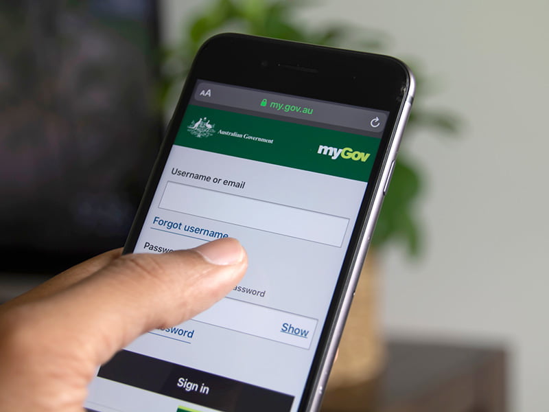
The federal government has launched its revamped myGov platform, as its full attention now turns to delivering a long-promised smartphone app for accessing government services online.
Services Australia flicked the switch on the new myGov on Monday, having revealed plans to permanently replace the legacy platform – which was last upgraded in 2017 – last month.
“From today, the myGov website has changed colour from green to blue, as part of a broader upgrade,” Government Services minister Bill Shorten said.
The changeover was followed by reports of issues in myGov accounts for some users on Monday, with the source of the problems now the subject of an investigation by the services agency.

While the upgrade is largely cosmetic, including a new layout to help people see the inbox messages and linked services more easily, additional functionality is expected to be added over time.
Minister Shorten said the “upgrades will immediately give Australian’s more options when using the site” but stressed that they were “only the beginning”.
“The latest upgrades to the myGov website means it has the flexibility to adapt to meet people’s information needs and preferences into the future,” he said.
“Users will also be connected to services based on life events. The initial topics include raising kids, changes in living arrangements, ageing, work, education and health and disability…”
Services Australia has been beta testing the new myGov with users since September 2021 and began actively prompting users to try it out during tax time in July.
Underpinned by the government’s digital experience platform (GOVDXP), the new myGov is the result of more than two years of development by US consulting giant Deloitte.
Deloitte has been involved with the redevelopment since the very beginning, having landed an near-$1 million contract through a limited tender to develop a prototype for the new platform.
Since then, Deloitte has been paid more than $30 million for its work, with additional contracts awarded through a Systems Integrator Panel also consisting of Accenture, IBM and Arq Group.
A further $32 million has been handed to Adobe for the “core technology components” behind the new myGov.
With the website switch now complete, Minister Shorten said “busy work” was now underway on the first myGov app, which will be “delivered soon”.
The app – which, like the upgraded myGov website, has been developed by Deloitte at a cost of $5.5 million – went into private beta testing December 2021.
The government flagged the need for a single government app to provide access to myGov services in 2019.
“We want Australia’s government services online to be the world’s best and the app, to be delivered soon, will further boost and simplify the user experience,” Mr Shorten added.
The government is planning an audit of the myGov platform in the coming months to shape the platform’s future.
Do you know more? Contact James Riley via Email.


In about 1998 when Acumentum was researching citizen mental models for the design of the first vic.gov.au we tested the UK initiative they called life events. My design team asked me to watch a video of a focus group of 18 year olds discussing the turning 18 life event. I roared with laughter and have never forgotten a very clever and somewhat opinionated 18 YO blurting out “turning 18 is not a life event its just a fucking good party”. In the decades since I’ve noticed macro processes like life events of getting married, having children are never central to the user at the interface. It is the event, the party they want to organise that drives how they are thinking. In using MyGov I’m entirely underwhelmed. The basics are clunky and frustratingly difficult to use.